
Updated bi-weekly
The chart below shows which age groups and time slots for each subject have received the most enrollments over the last two weeks. Think about adding sections of your popular classes during these times or for these age groups to meet demand!
September 23, 2025
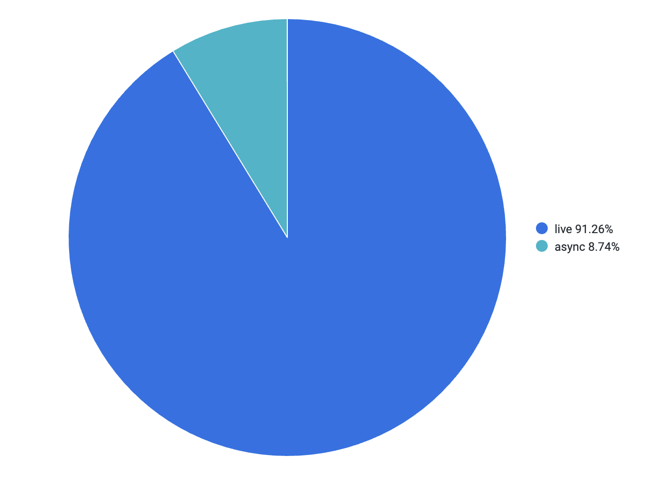
Enrollments by Delivery: (Live or Asynchronous)
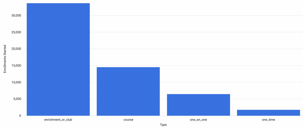
Enrollments by Activity Type
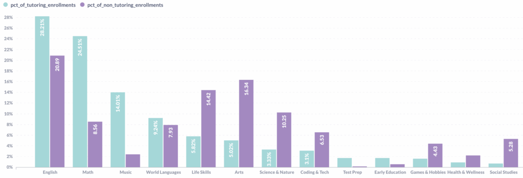
Enrollment distribution by Subject – Tutoring and Non-Tutoring
Attendance Distribution Last Week
This dashboard tells you – if there were 1000 attendances for live class enrollments last week, when did they take place?

